
Data in the raw: Violin plots
One of the ways we can increase transparency in science, in addition to posting our data, materials, and pre-registering our methods, is to start including more information about our raw data in our write-ups and reports. One of the ways we can do this is just show it in a visualization.
The bar chart with error bars (usually \(\pm 1.96 \times\) standard error for a 95% confidence interval) is a classic plot type, but it obscures a lot of information about the underlying distribution that generated it. Scatterplots and histograms show more of the raw distribution, but they can be messy and hard to cleanly overlay with summary statistics.
Fortunately, violin plots bring together the informativeness of a histogram with the cleanliness of a bar chart, and they can be easily overlaid with summary statistics, error bars, and other information without too much additional clutter.
library(ggplot2)
library(dplyr)

set.seed(836)
dat <- data.frame('condition'=c(rep('t1', 30), rep('t2', 30)),
                  'value'=c(rnorm(30, 10, 3), rnorm(30, 20, 7)))
Here is the simplest incarnation of a violin plot, for two normally distributed groups:
basic_violin <- ggplot(data=dat, aes(x=condition, y=value)) +
  geom_violin(aes(fill=condition, color=condition)) +
  theme_minimal()

print(basic_violin)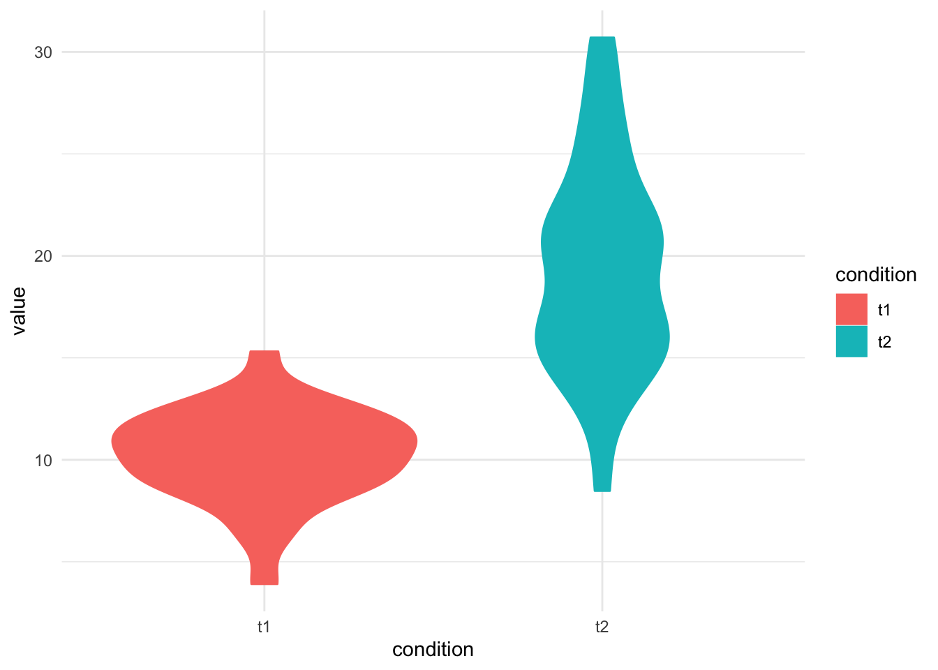
These might be more accurately called “jug” or “vase” plots, since they rarely make pretty violin shapes and more often tend to look like postmodern sculpture. Name aside, the violin plot is a rotated, symmetric kernel density plot that shows the density of points at different values. Where the plot is wide, there is a high density of points; where it is narrow, a low density of points (like height on a histogram). We can see here that group T1 is less variable than T2; T1’s violin is short and squat, meaning most of the points are massed in a small region. T2, on the other hand, is tall and narrow, meaning the points are spread thinner along a wider range of values
These guys looks a little sparse, though. Why don’t we dress them up a smidge?
Maybe you like a point mean and \(2*\)SE error bars:
errbar_lims <- group_by(dat, condition) %>%
              summarize(mean=mean(value), se=sd(value)/sqrt(n()),
                        upper=mean+(2*se), lower=mean-(2*se))

mean_se_violin <- ggplot() +
  geom_violin(data=dat, aes(x=condition, y=value, fill=condition, color=condition)) +
  geom_point(data=errbar_lims, aes(x=condition, y=mean), size=3) +
  geom_errorbar(aes(x=errbar_lims$condition, ymax=errbar_lims$upper,
                ymin=errbar_lims$lower), stat='identity', width=.25) +
  theme_minimal()

print(mean_se_violin)
Or maybe boxplots are your jam:
boxplot_violin <- ggplot(data=dat, aes(x=condition, y=value)) +
  geom_violin(aes(fill=condition, color=condition)) +
  geom_boxplot(width=.1, outlier.shape=NA) +
  theme_minimal()

print(boxplot_violin)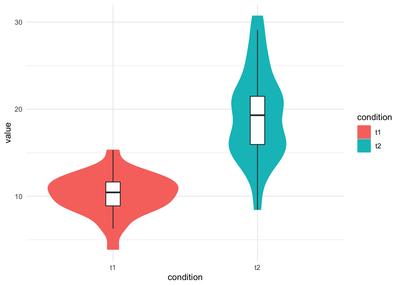
Here’s the way I like to do my violin plots, with each subject’s point plotted plus a horizontal line for the mean. I add a little horizontal jitter to each point to make things easier to see:
scatter_violin <- ggplot(data=dat, aes(x=condition, y=value)) +
  geom_violin(aes(fill=condition, color=condition)) +
  geom_crossbar(stat="summary", fun.y=mean, fun.ymax=mean, fun.ymin=mean, fatten=2, width=.5) +
  geom_point(color="black", size=1, position = position_jitter(w=0.05)) +
  theme_minimal()

print(scatter_violin)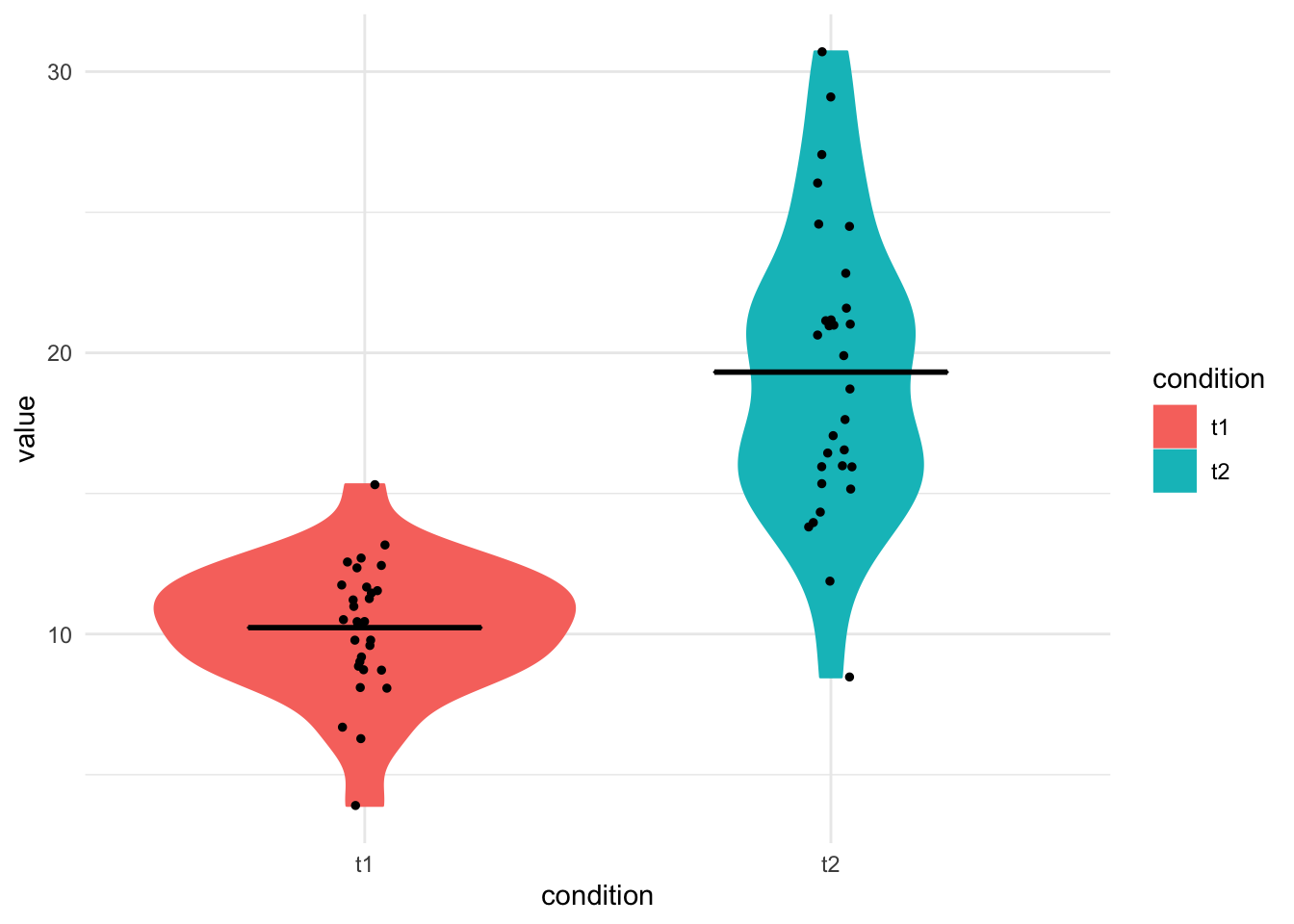
There are a few things I really like about violin plots. One, they add a lot more information without taking up any more space than a bar plot would. Two, they give you an intuitive way to look at the distributions of your data. I don’t think many of us are accustomed to seeing data this way, and it goes to show that even well-behaved data doesn’t necessarily look like we might expect. t1 is just as normal as t2, but t1 “looks” a lot more normal than t2 does. You lose a lot of the characteristics of the data with a bar plot:
bar_plot <- ggplot(data=errbar_lims) +
  geom_bar(aes(x=condition, y=mean, fill=condition, color=condition), stat='identity', position='dodge') +
  geom_errorbar(aes(x=condition, ymax=upper,
                    ymin=lower), stat='identity', width=.25) +
  theme_minimal()

print(bar_plot)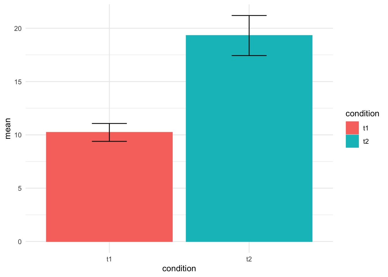
It captures the broad strokes, to be sure, but a lot of the finer details disappear.
So there you go. Violin plots! Dress ’em up, dress ’em down. However you like them, they’re a nice plot type to have in your arsenal.