
5 Minute Simulation: Variation in effect size estimates
If it’s not terribly obvious, Shiny is my new favorite toy. It’s incredibly accessible for beginners, gives you great results with minimal effort, and can be as sophisticated as you need it to be.
I decided to throw together a quick simulation to look at the variation in effect size estimates we can expect at different sample sizes. There’s an increasing focus in psych on estimation of effects, rather than simply detection of effects. This is great, but, as it turns out, virtually impossible with a single study unless you are prepared to recruit massive numbers of subjects. Nothing here is new, but I like looking at distributions and playing with sliders, and I’ll take any excuse to make a little shiny widget.
In this simulation, we’re doing a basic, between-groups t-test and drawing samples from the normal distribution. The code can be dead simple. I’ll write a tiny function to handle the simulating, and another to handle the plotting.
library(ggplot2)

sim_es <- function(n, true_es) {
  g1 <- rnorm(n, true_es, 1)
  g2 <- rnorm(n, 0, 1)
  return(effsize::cohen.d(g1, g2, paired=FALSE)$estimate)
}

plot_es <- function(data, true_es) {
  es_plot <- ggplot() +
      theme_minimal() +
      geom_histogram(aes(x=data, y=..count../sum(..count..)),
               color='darkblue', fill='darkblue', position='identity') +
      geom_vline(xintercept=c(true_es,
                              sort(data)[.975*length(data)],
                              sort(data)[.025*length(data)]),
                 size=1.5, color=c('lightgray', 'red', 'red'),
                 linetype=c('solid', 'longdash','longdash')) +
      xlab("Effect size") +
      ylab('Proportion') +
      xlim(c(-2, 2))

  print(es_plot)
}
Here’s what you get if you use tiny (n=10) groups (perhaps under the justification that if an effect is big, you’ll detect it just fine in small samples) and no true effect is present:
n10 <- replicate(3000, sim_es(10, 0))
plot_es(n10, 0)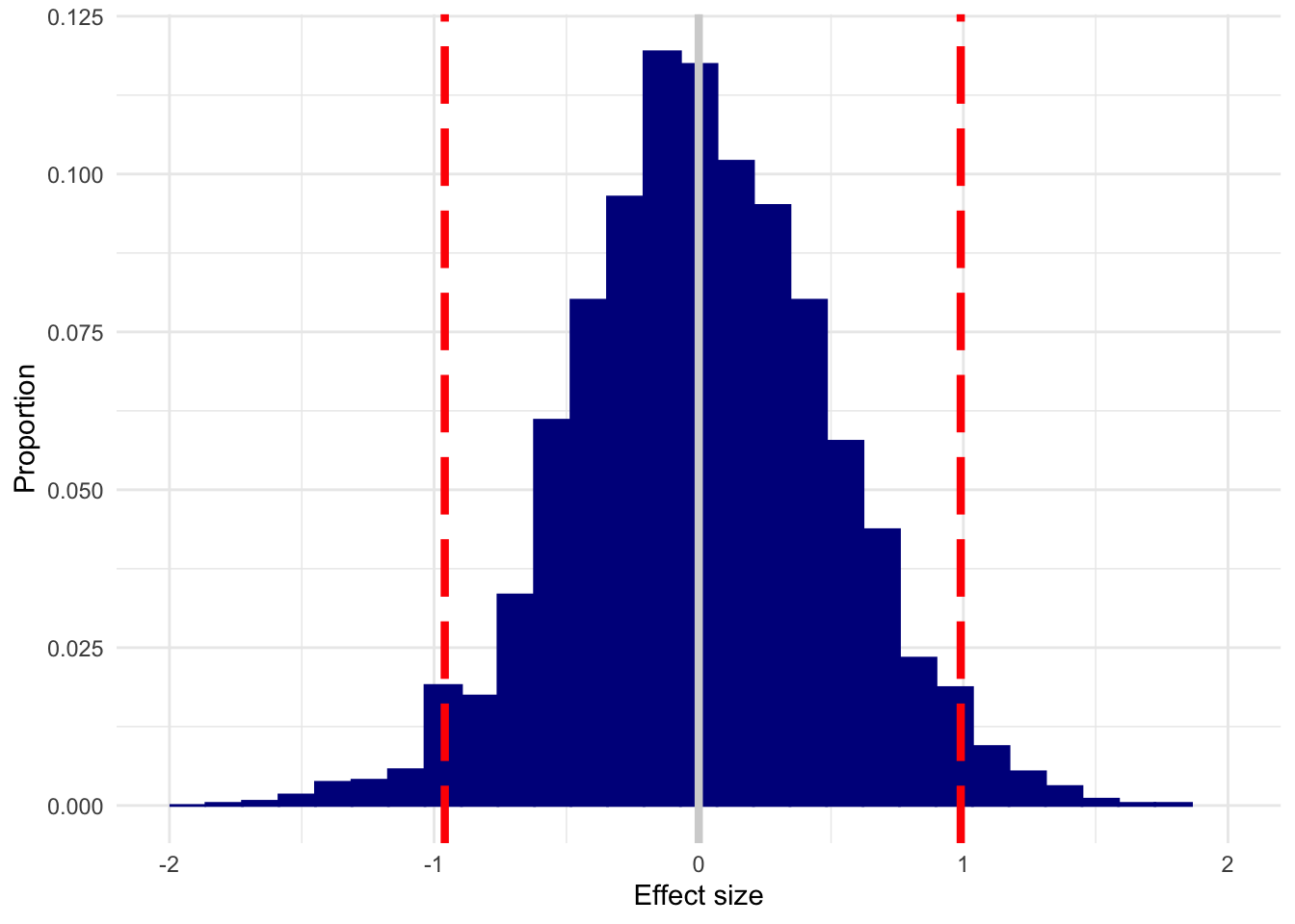
The white line is the true effect, and the two red lines mark out the 95% quantile.
Yikes. With samples that small, you could (and will, often!) get an enormous effect when none is present.
Here’s what we get with n = 50, no effect present. I’ve left the x-axis fixed to make it easier to compare all of these plots.
n50 <- replicate(3000, sim_es(50, 0))
plot_es(n50, 0)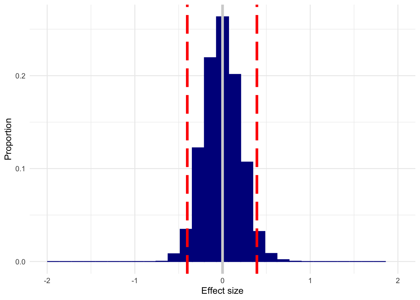
This is a dramatic improvement over n=10, but you could still estimate what is considered a small (d=.1, traditionally) to medium (d=.3, traditionally) effect in either direction with appreciable frequency.
And here’s n=200.
n200 <- replicate(3000, sim_es(200, 0))
plot_es(n200, 0)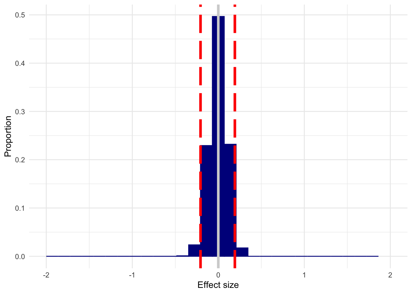
I’ve used d=0 as an example, but you get this spread regardless of what the true d is; it will just shift to center on the true effect. In that case, you’ll detect an effect most of the time, but can be way off about its actual size. This doesn’t mean that you can throw power out the window by arguing that you only care about detection, of course–you’ll “detect” an effect a lot of the time when d=0 with small samples.
These simulations are the result of 3000 replications each, but in the shiny app you can change this number.
For me, this really drives home just how important replications and meta-analyses–cumulative science in general, really–are, particularly for estimation. When you do a lot of these studies over and over again, as these simulations model, you’ll zero in on the true effect, but a study can’t do it alone.
The Shiny app can be found here. You can tweak group size, true effect size, how many simulations are run, and the limits on the x-axis. You can also view a plot of the corresponding p-values.
The source code can be found here.